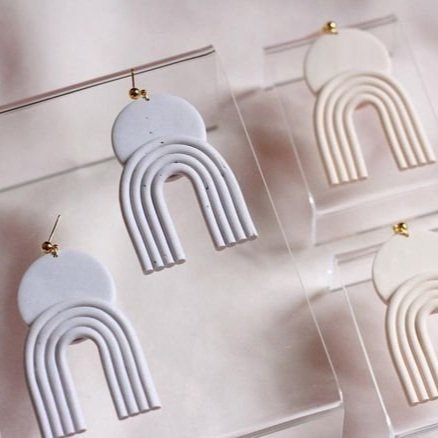
Businesses that sell clay earrings often blur together for me. The earrings often have the same mold. They capture similar colors. And their branding feels all the same. Most likely including some cursive. For Court & Clay, I wanted it to stand apart.
I wanted to color palette to remind me of an Arizona desert sunset. Soft, yet earthy. I wanted the textures to mirror the natural qualities of clay. And lastly, I wanted our visuals to feel chunky and geometric, similar to the clay earrings Courtney created. Here’s to the new day of Court & Clay!
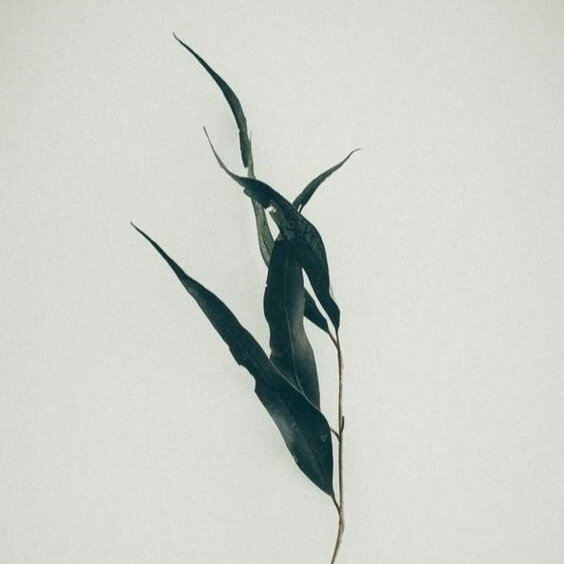
MOODBOARD
TEXTURED | CHUNKY | COLORFUL | ORGANIC | QUIRKY | PLAYFUL


The following images were sourced on Pinterest