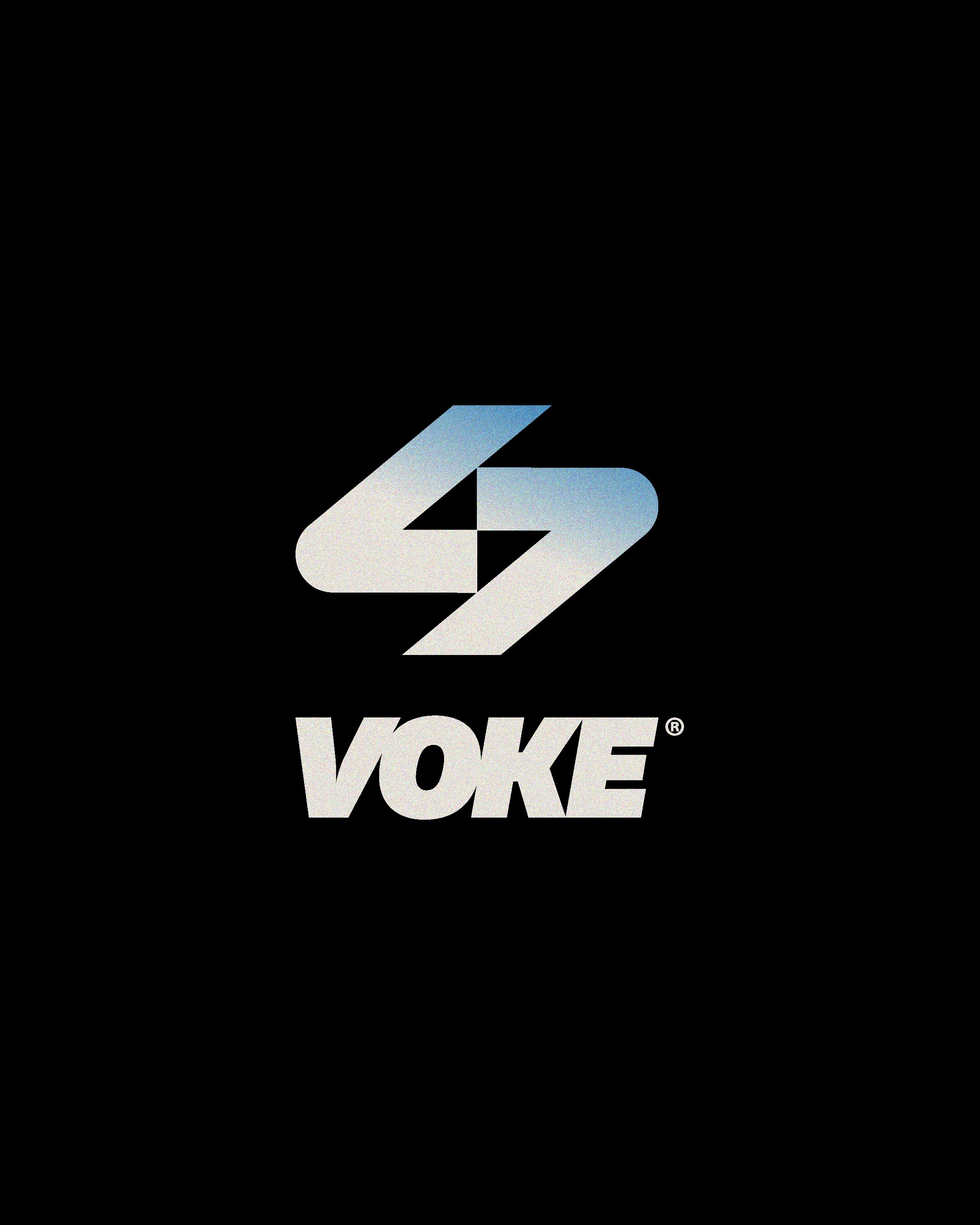
Voke Branding
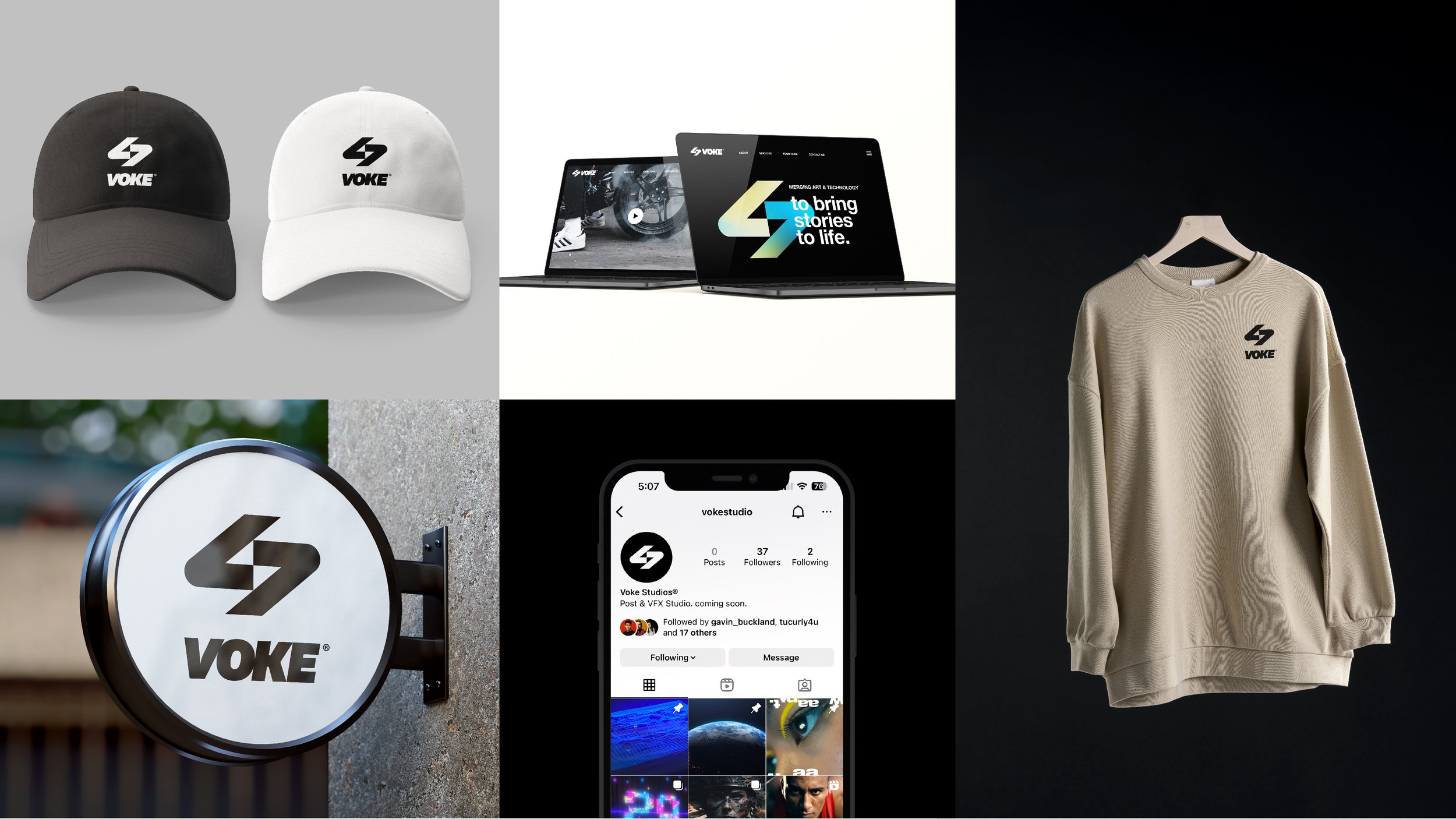
Voke is a post & VFX studio. Its name derives from the word ‘evoke,’ meaning to elicit a response. While their vision was to tell moving, impactful stories, they needed a brandmark that matched it.
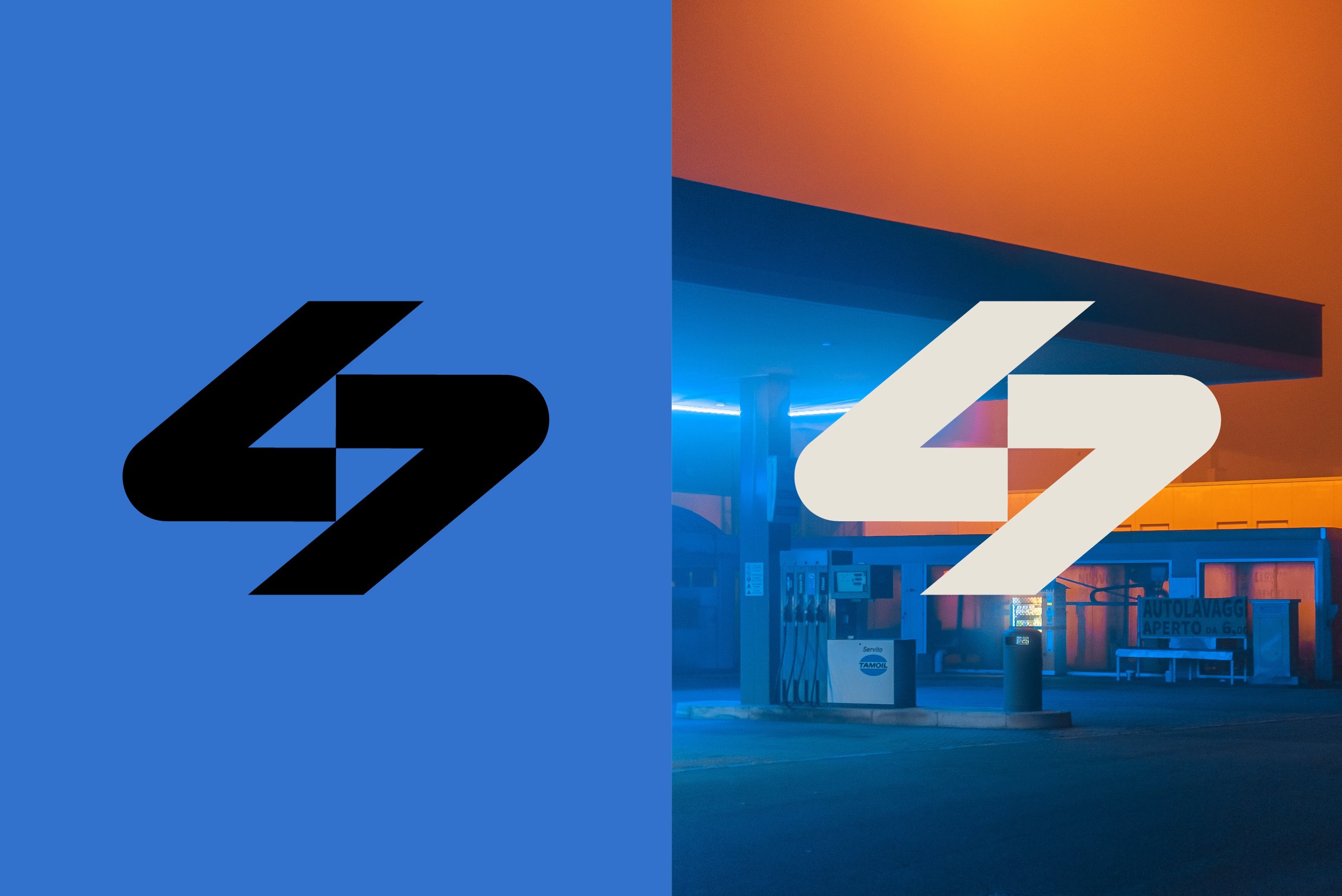
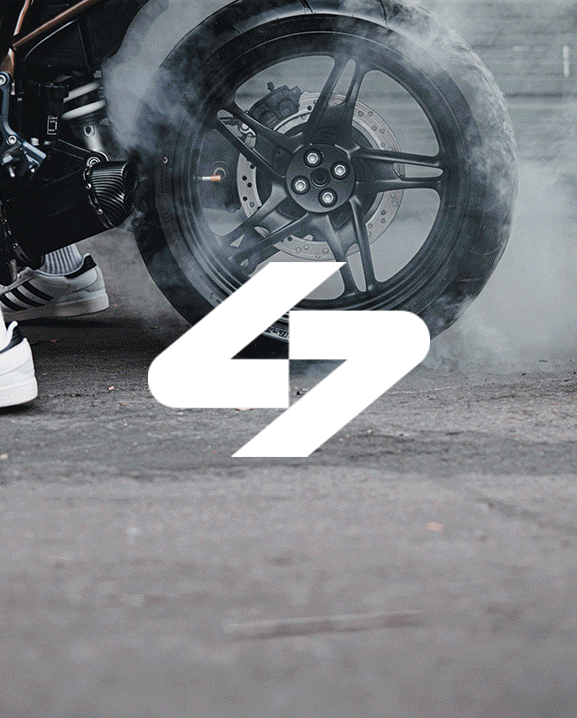
In the early stages of the project, we defined what this brand mark needed to accomplish. The logo perimeters if you will. We came to an agreement that it should feel bold, futuristic, and epic. It was to be clean and simple, yet intentional. The logo should create opportunities to tell the brand story. And finally, the brand should include an icon, ideal for the different platforms and mediums it would be seen on.
BOLD / FUTURISTIC / EPIC /
BOLD / FUTURISTIC / EPIC /

The final logo is an abstract monogram that forms a lightning bolt. But beneath that, this mark is working to tell the brand story. The icon communicates:
Partnership: two strong forces come together, representing its founders. Creativity: ideas strike, and they keep on striking. Power: Voke will tell moving stories and take audiences on a journey. Collaboration: the pinwheel represents different sectors coming together, such as art and technology.